How to choose a color scheme for the interior
It is very important to think through and choose the right color scheme for the interior, be it your own home or office space. Given the diversity now available, this is not easy. In this regard, a number of some nuances should be taken into account that will help to make a choice.
Interaction of interior items with the selected color scheme
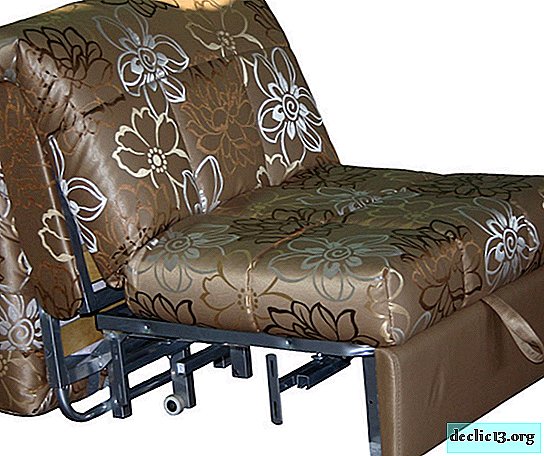
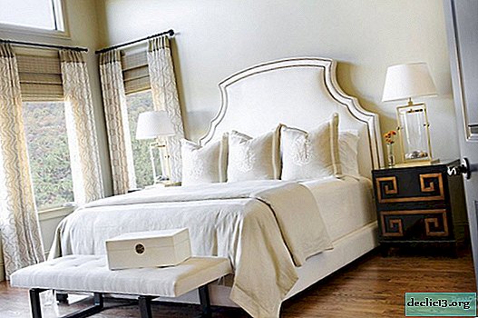
Do not forget about the combination of colors with textiles and interior furniture. For example, the color of the walls of the room should be selected taking into account the color of the furniture, and not some other items, in order to achieve harmony in the design. If the furniture is not catchy, then the walls should in no case have a bright pattern, so as not to distract attention from the furniture, but rather highlight it in the space of the room. It is also necessary to consider textiles, i.e. for example, if curtains, bedspreads, as well as furniture upholstery have a patterned pattern, then the walls must certainly be smooth. Floor coverings and upholstery should also be in harmony with the color of the walls.
What to consider when choosing a color scheme
The selected color scheme will be present in all finishing and decorative materials, therefore it is a very important element, because The cosiness and comfort of the room depends on this.

Color is a powerful tool in terms of exposure to humans, because carries certain "information" that is perceived at the subconscious level. For example, red psychologists define as quite aggressive, albeit bringing joy and confidence, if not present in large quantities. Oversaturation of this color is tiring and even annoying. While the color blue is cold, serious and calm. Ideal for offices, as prompts deep reflection. Yellow is perfect for children's rooms, as very sunny and warm.

Do not forget about the combination of colors, which is desirable to minimize. All tones should be harmoniously combined with each other. Otherwise, the visual effect of "eating up space" may occur. To avoid this, and also, for fear of making mistakes, there are simple rules: lighter and darker shades of the same color are always perfectly combined.
Classic style - the predominance of lighter, as well as muted pastel noble tones. Such as light green, yellow, blue.
Retro style is a combination of rather bright tones based on contrast: orange with blue, pink with green, i.e. the most unexpected options.
Art Nouveau style - preference is given to golden, creamy brown shades.
Mediterranean - the prevalence of the natural gamut of colors: green, olive, turquoise, blue and lemon.
Minimalism style - based on a light palette diluted with black, gray or brown tones. Thus, restraint and severity of the interior are emphasized.
Chinese style - like Japanese implies the use of natural materials, in connection with which the main colors are brown and beige tones. The choice of colors in many respects determines the style of the interior.

A few words in conclusion
If, when choosing the color scheme of the interior, all the details and nuances are taken into account, then in addition to harmony, you can also make adjustments to the space if necessary. Using certain color solutions, visually the space can be both reduced and increased. Although usually, when choosing a color scheme for an interior, a person prefers that color that matches his personal qualities. In other words, the prevailing color of the interior determines the character of its owner, as well as its taste, personality and its own view of the world.
Watch the video: How to choose the right color palette for your home (November 2024).


-
The chemical composition and calorie content of radishes, the benefits and harms of vegetables for health
Radish is one of the earliest vegetables to be the first to ripen in the gardens. It has long been at our tables and we enjoy its fresh and delicate taste. But do everyone know about its beneficial properties and the substances that it contains. This article describes in detail the composition of the root crop, its useful properties, gives recommendations for its proper use in the human diet. ... -

-

-